Background
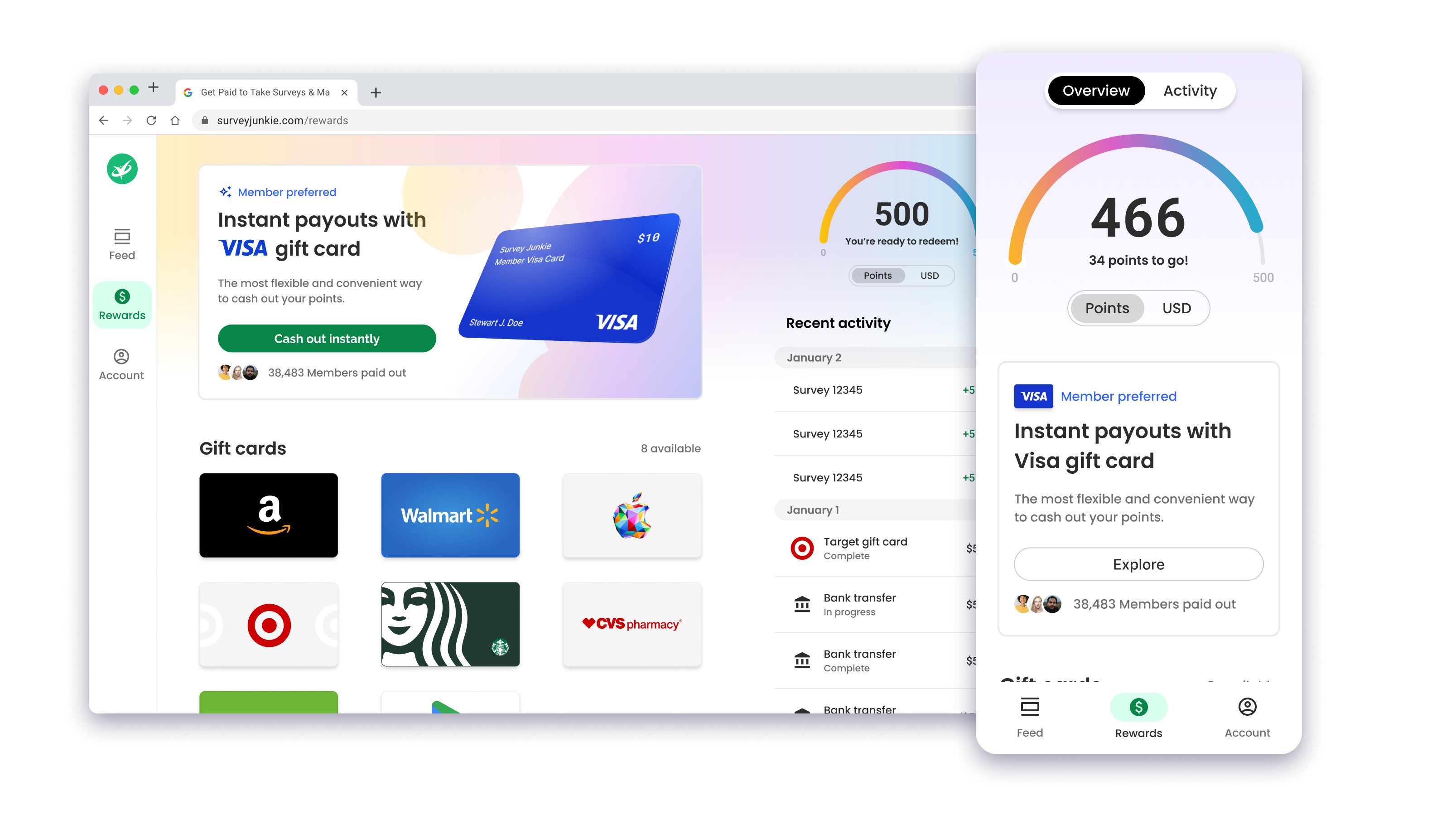
Survey Junkie is a mobile and desktop app that delivers market research surveys for users to take and get paid for sharing their opinions. In 2021, the newly formed Consumer Design team embarked on a 1.5 year design and development project to completely transform Survey Junkie from a dated monolithic application to a design-system-based SPA, native Android, and iOS app. I had design ownership over the Rewards section of Survey Junkie.
Project Goals
Make rewards a top-level feature
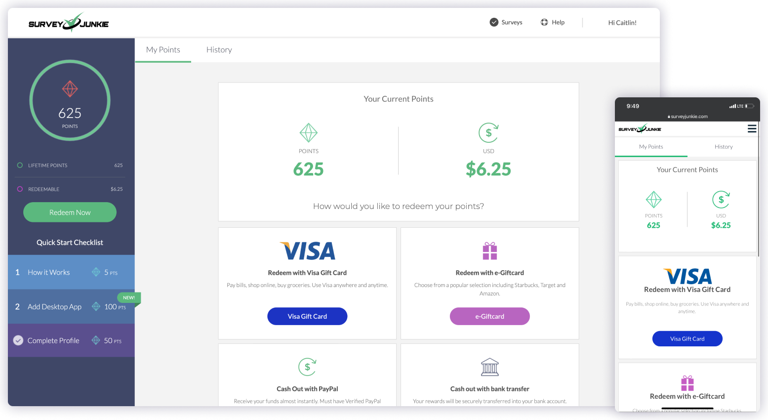
In the legacy Monolith, Members couldn't see rewards until they hit 500 points, hidden behind an ephemeral "redeem now" button. The single biggest point of value in the app was invisible until very late in the journey. We made rewards front and center from day one.
Streamline the redemption experience
Gift cards sat behind needless 2FA, bank transfer handed over sensitive information with little explanation, and the gift-card workflow booted Members out to a third-party site entirely. We set out to make redemption straightforward and to keep Members in-app end to end.
Make the delightful experience actually delightful
Getting rewarded for your time should feel like a moment of celebration, not a transaction. We brought delight to rewards through color, microcopy, and animation.
Process
1. Audit & analyze
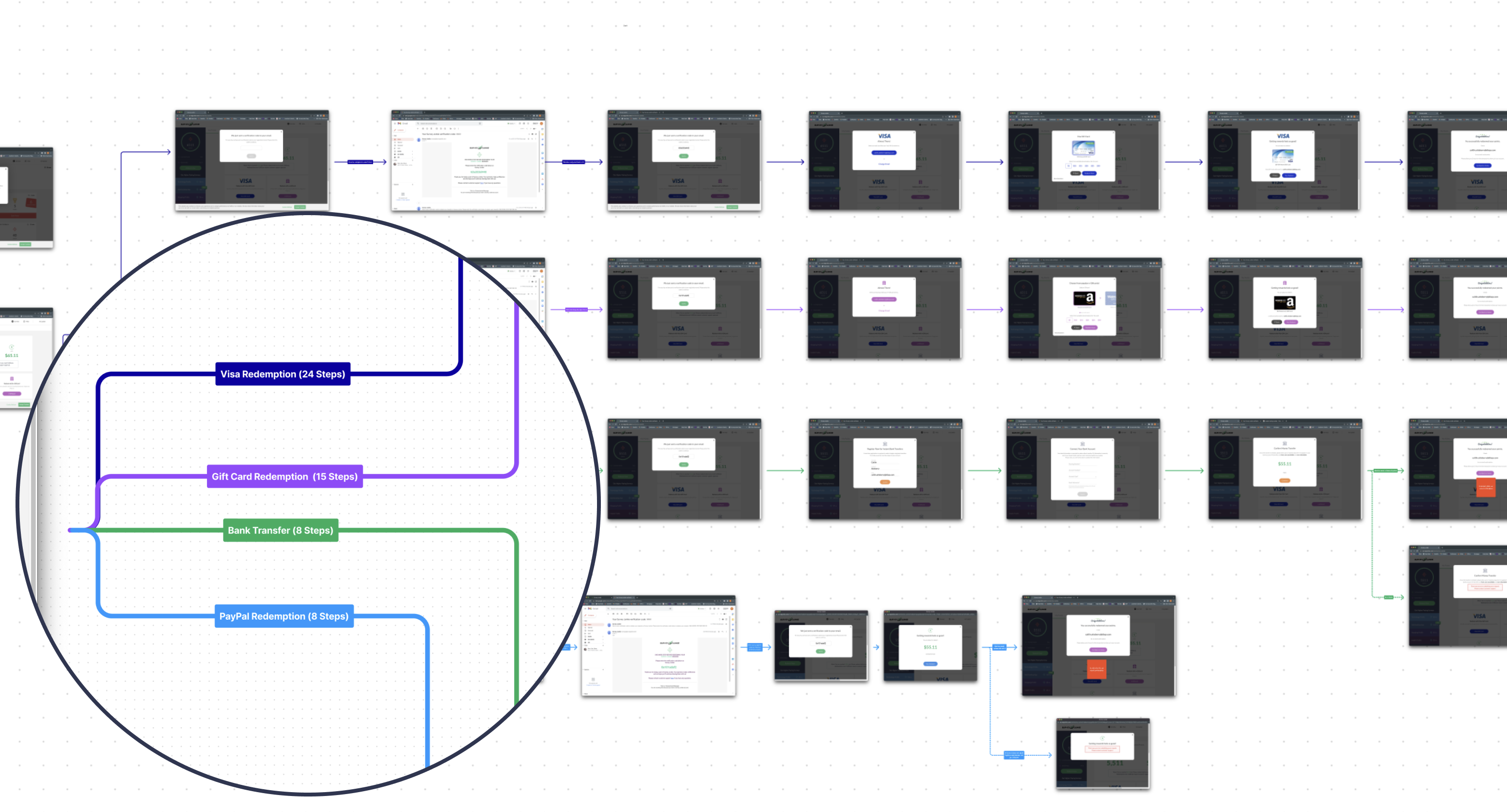
I mapped every redemption path in Figma to show stakeholders exactly where the friction lived. Visa redemption alone took 24 steps, gift cards took 15, and even the "simpler" bank transfer and PayPal paths took 8, all bouncing Members between Survey Junkie, their email, and an external vendor's site just to cash out. Every one of those handoffs diluted the brand and confused the Member.
I also talked with our Member Support team to understand the top support issues that Members were reaching out to support to remedy. The Member Support team was handling hundreds of tickets per week due to the unclear and confusing redemption experience in the Monolith.
2. Design & refine
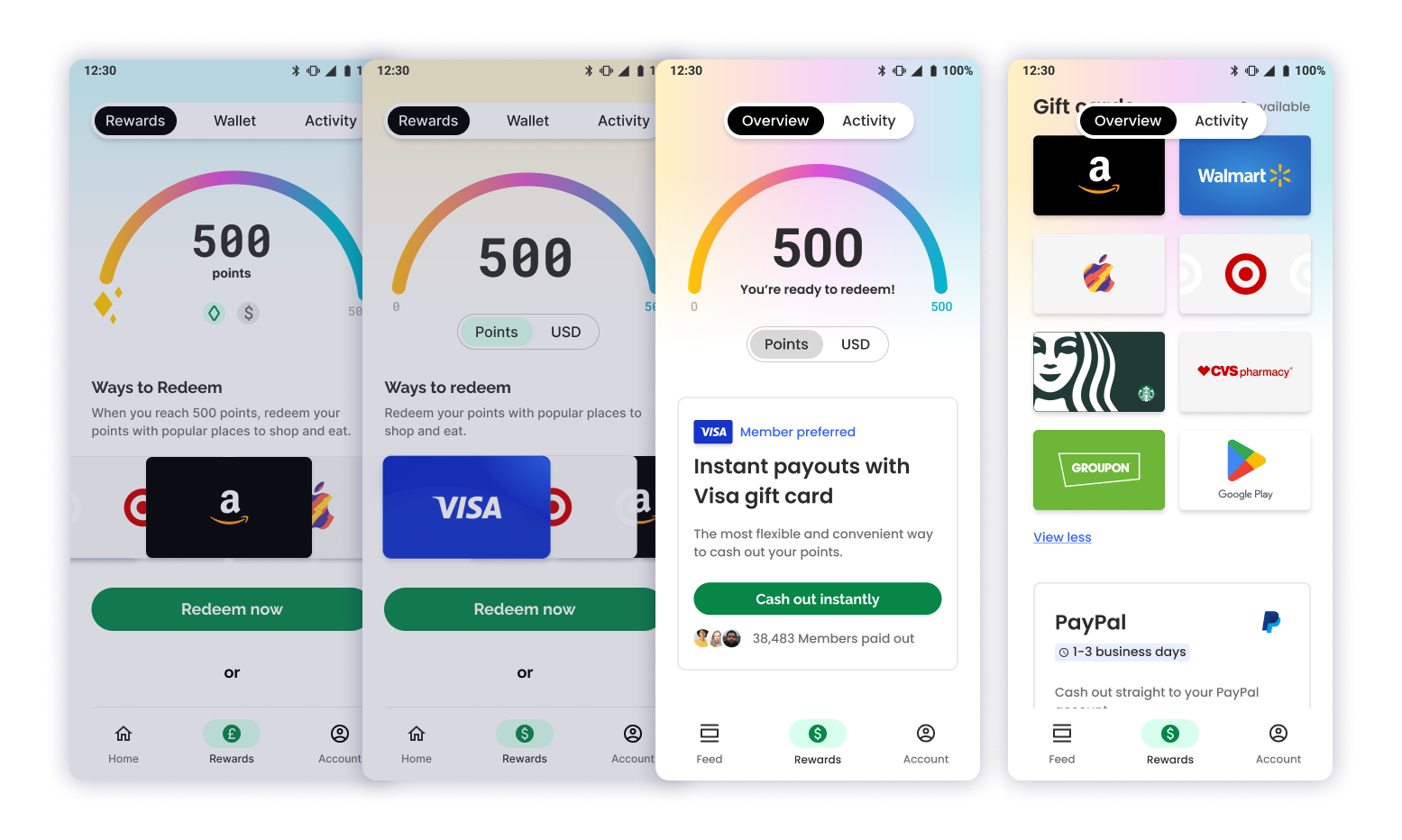
Using our new design system, I created a streamlined redemption experience for each reward type for SPA (mobile, tablet, and desktop) and native iOS and Android. We went through many iterations of the points visualization and rewards page until we felt the design was elegant, concise, and delightful.
3. Test & refine
We ran first-time and second-time unmoderated usability tests to see where Members still got tripped up once the new workflow stopped being novel, and refined from there. Once the redesign was stable, we A/B tested it in production against the legacy Monolith for a real, apples-to-apples read on engagement and retention.
Results
The redesign held up against the Monolith on every metric we tracked. Redemption completion rose as paths that ran up to 24 steps collapsed into a single in-app flow, retention improved as rewards moved from a hidden, late-stage reveal to a top-level feature, and Member Support's redemption-related ticket volume dropped as clearer status, error states, and in-app tracking replaced the guesswork of the old flow.
Conclusion
As a newly formed Product Design team, we weren't just redesigning a rewards page, we were establishing the brand and design system while building the platform underneath it at the same time. Turning a redemption path that once ran up to 24 steps into something Members trust enough to return to is the clearest proof that the bet paid off.